


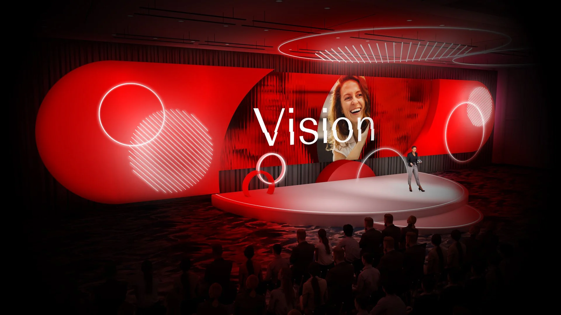


Client: Johnston & Johnston
Brief: To brand a large-scale internal meeting for the Vision division of Johnston & Johnston
Solution: The creative concept centered around the idea of clarity and collaboration. Two intersecting circles, representing lenses, formed an eye shape where they overlapped — symbolizing clear focus on the patient. This cross-section, called ‘The Clarity,’ also subtly formed a ‘V’ for Vision. This approach not only visually embodied the importance of patient-centered care but also provided a scalable and cohesive brand identity for the internal event.